

Helping to Create Hope
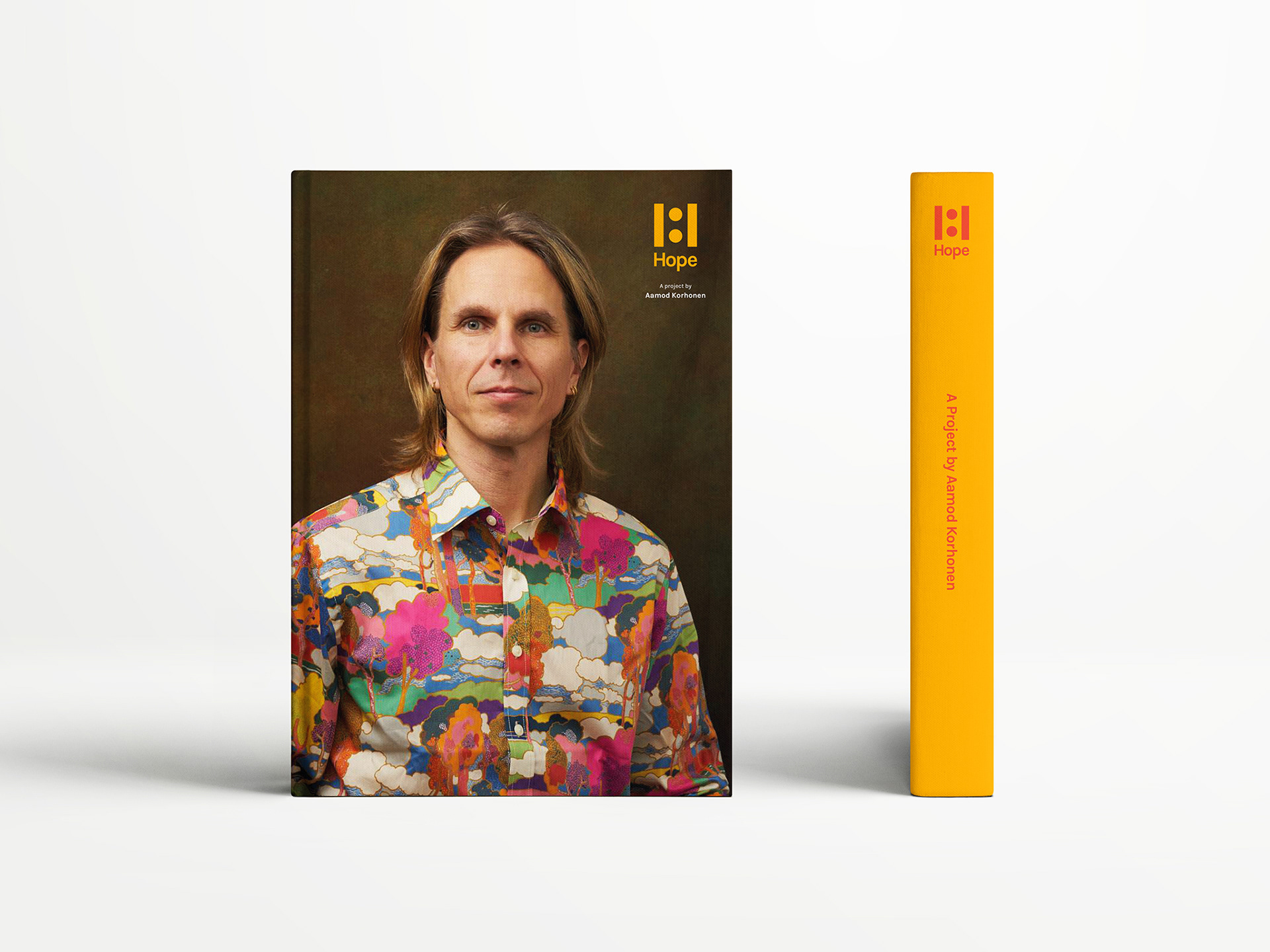
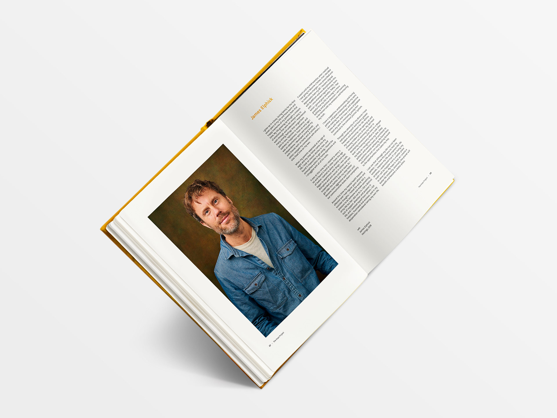
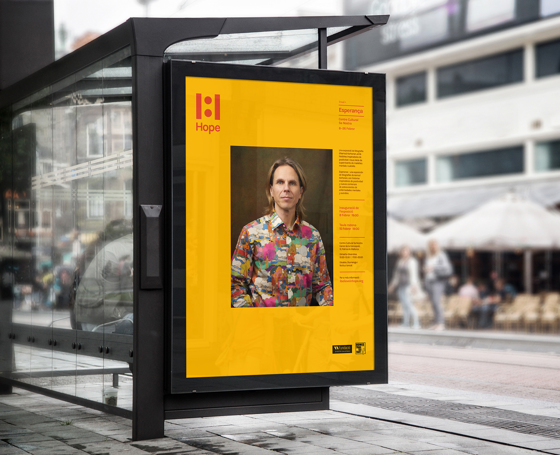
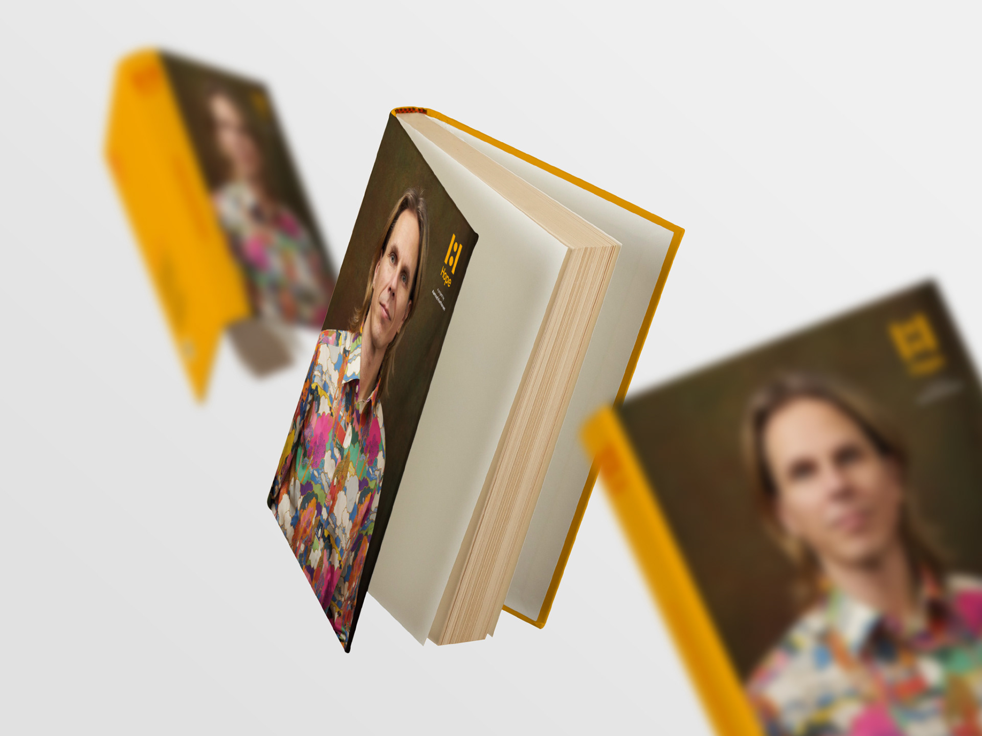
Hope is a charitable arts and photographic project set up by Aamod Korhonen to help tackle the stigma that surrounds mental health issues and suicide. It takes the form of an exhibition; seminars; web and social content; and eventually a book that will compile all the photography and survivor stories.
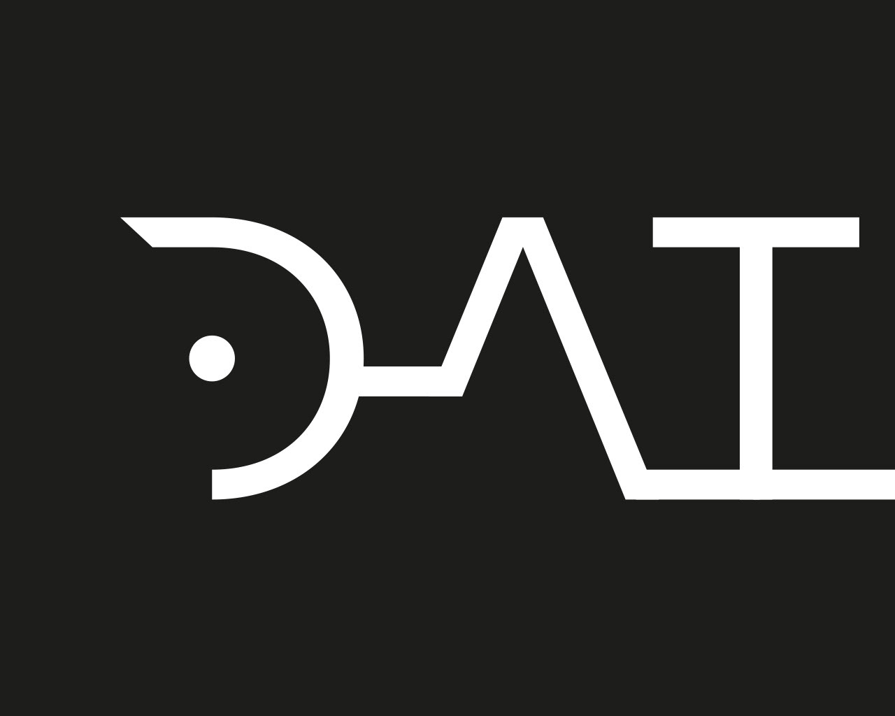
I created the branding and visual identity for Hope, founded on the concept of dialogue, which lies at the heart of the project. The stems of the H within the logo represent two sides of a conversation: on one side, the survivors bravely sharing their story; on the other, the listeners learning from them and using that knowledge to create their own positive outcomes. In the centre the two sides are bound together with a colon; the mark used in punctuation to introduce an idea that is a continuation of the one that precedes it. As a whole, the logo can be seen as a symbol of positive transformation: a journey from one state to another.
Client: Hope, 2019–2021
Role: Creative & Art Direction, Design, Branding
Deliverables: Logo, Branding, Book Design, Posters, Flyers, Exhibition Infographics


