Rebranding M&S Outlet
Wanting to capitalise on the rising popularity of the outlet sector, Marks & Spencer asked me to freshen up their Outlet store branding, in-store signage, navigation and improve the clarity of their pricing structure.
I created an identity that, whilst in-line with the M&S master brand, is distinct from it; with the ability to be adapted and used throughout the store and other messaging.

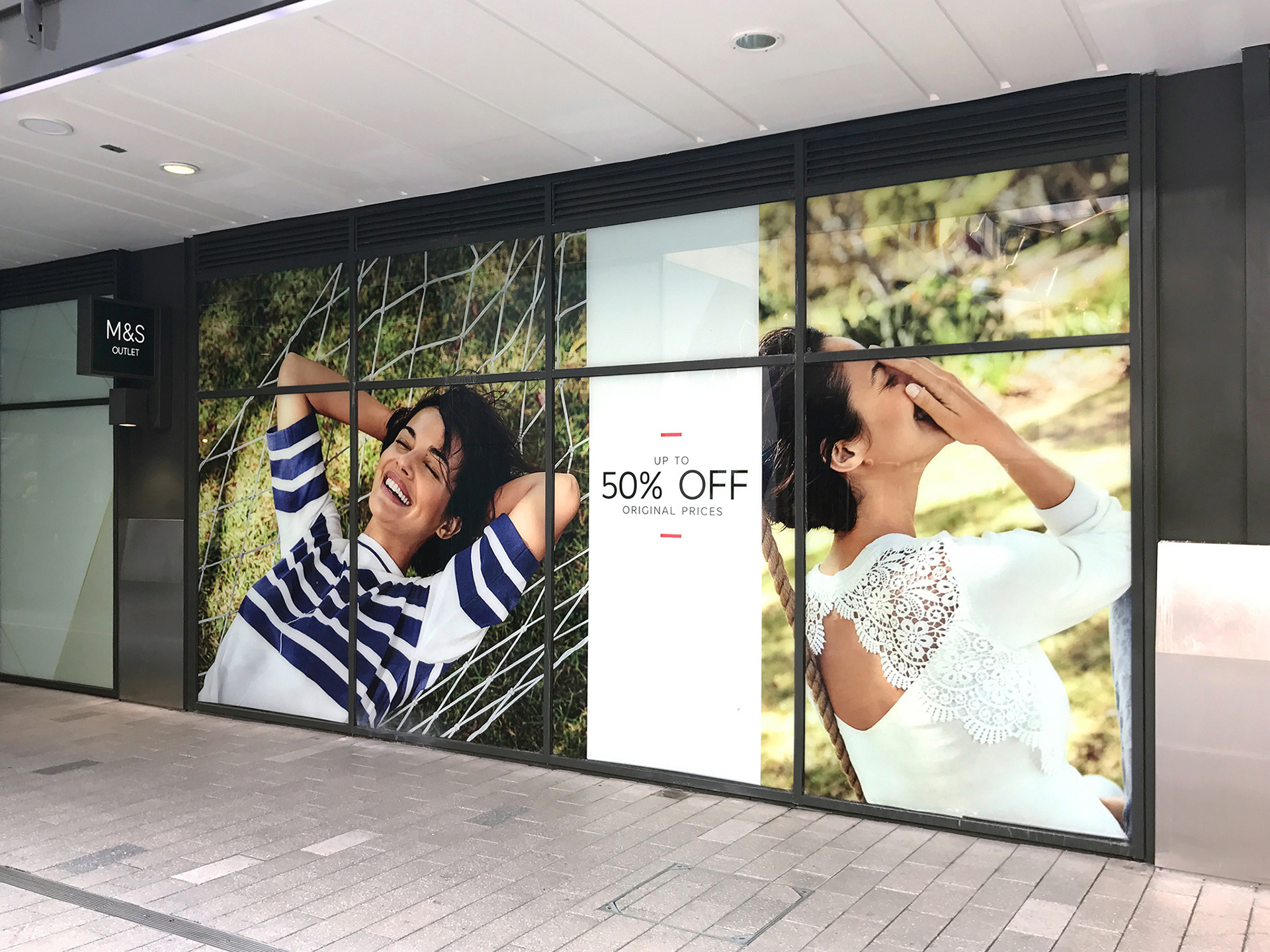
Brand application overview using in-store artwork formats
As the stores have a vast array of different products, ranges and brands, they could feel visually cluttered and overwhelming. I stripped everything back to create more calm, with a simple colour palette to help customer navigation and clear messaging that still has a friendly M&S tone.
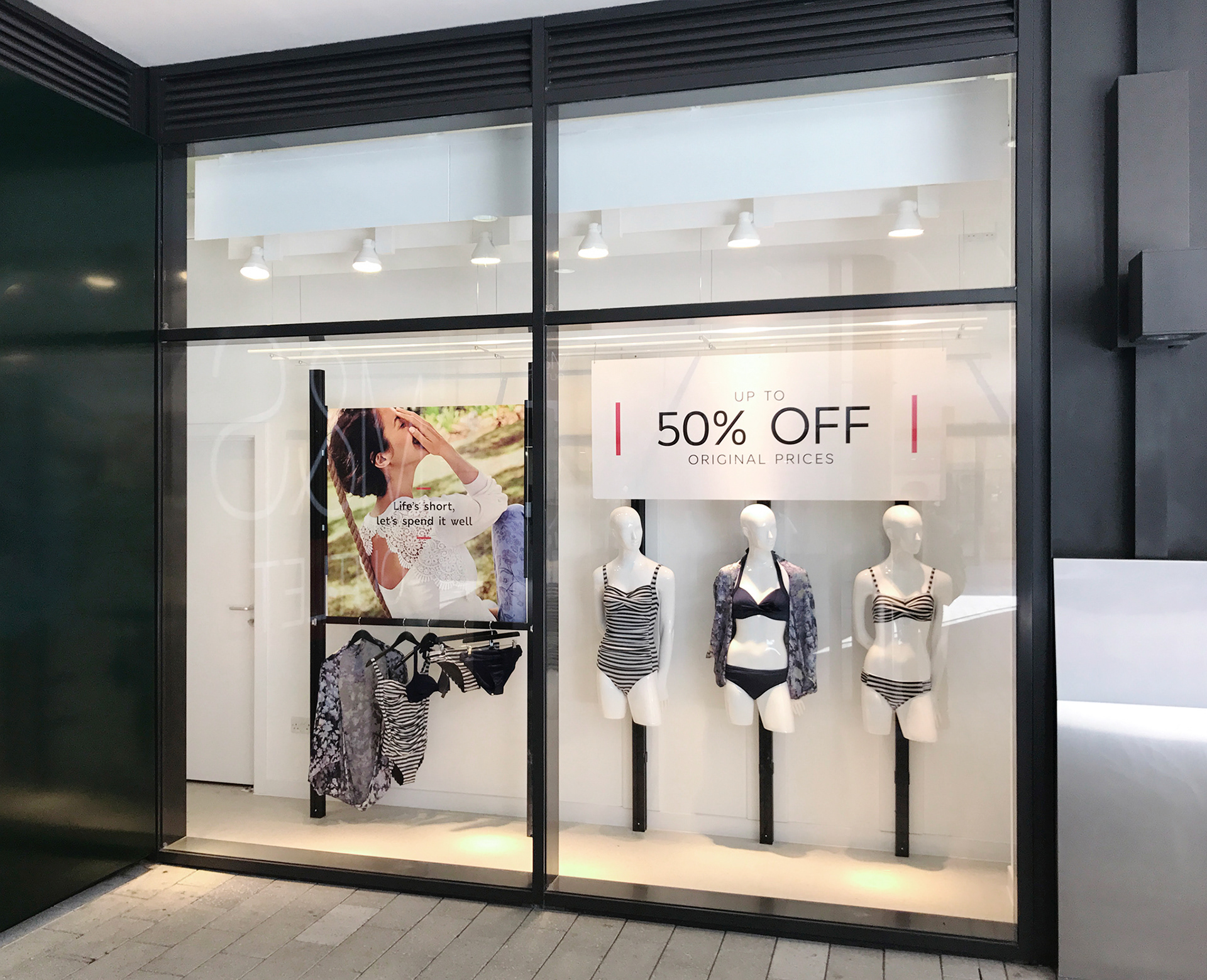
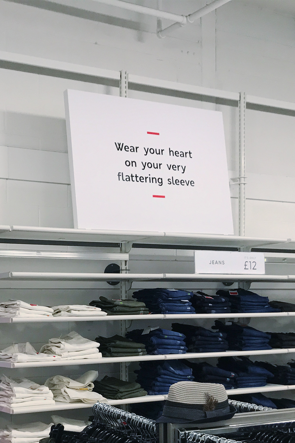
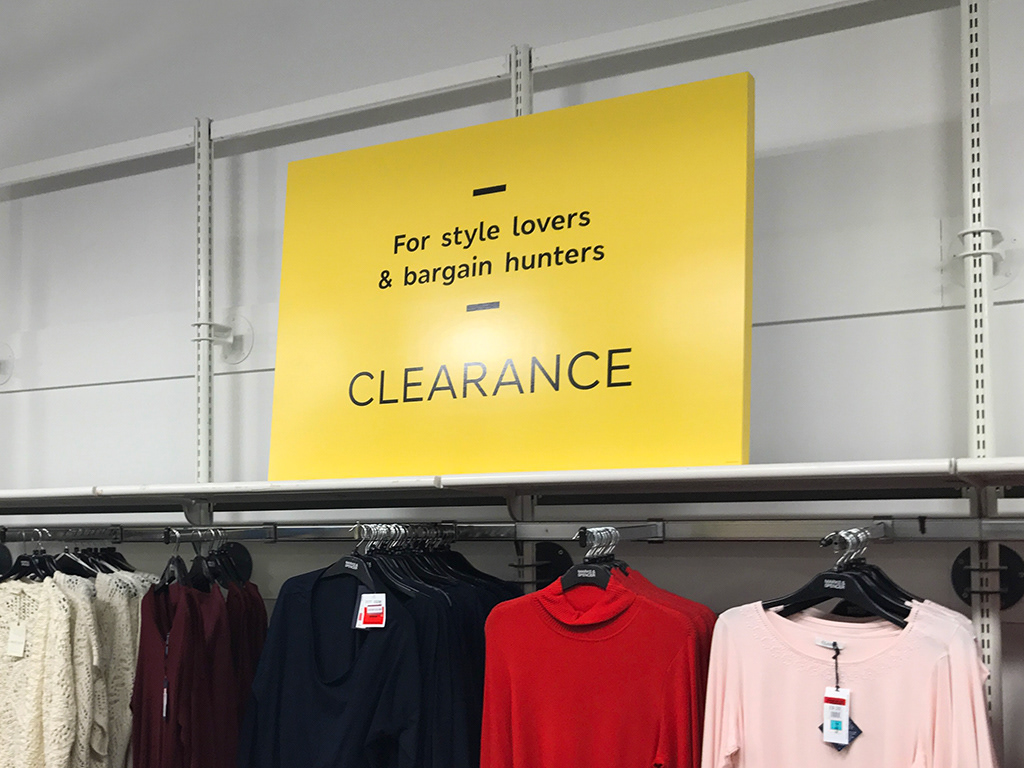
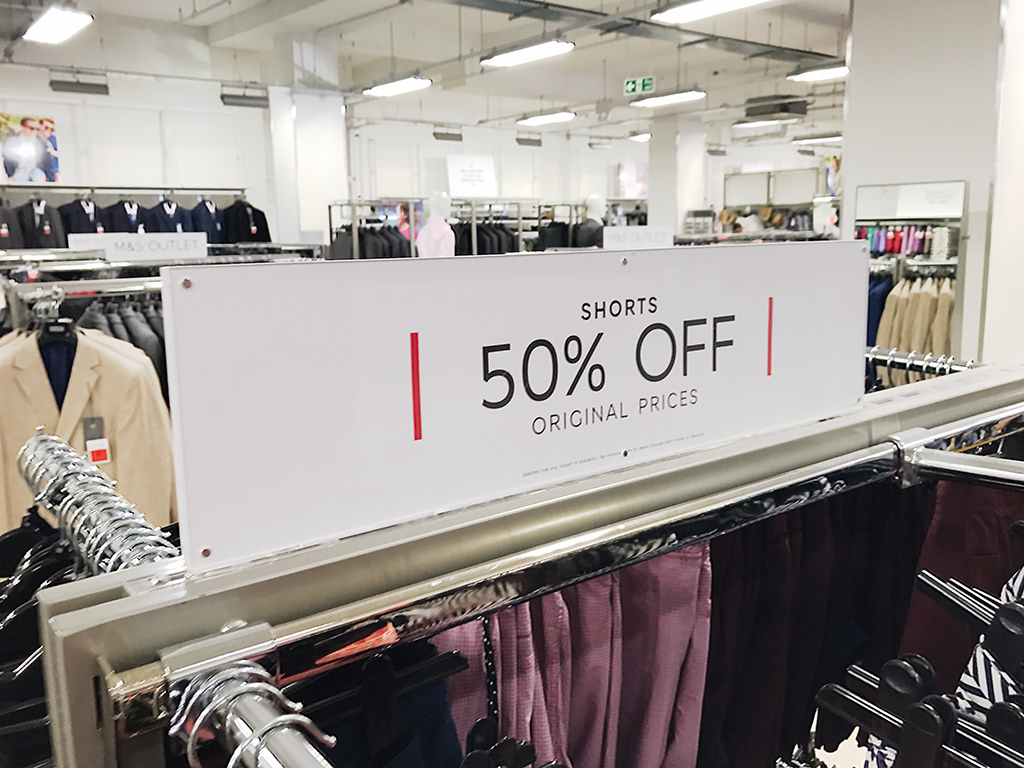

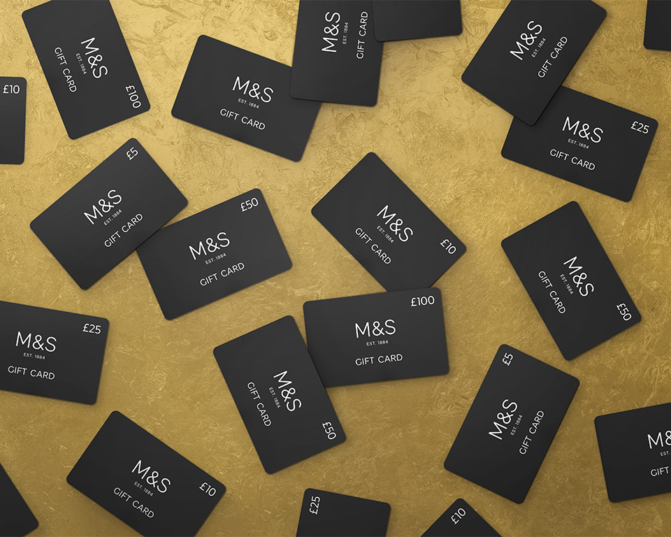
The system was designed to work with the diverse amount of artwork formats used within the stores; the five different tiers of pricing; and have the ability to be adapted for brand takeover promotions.
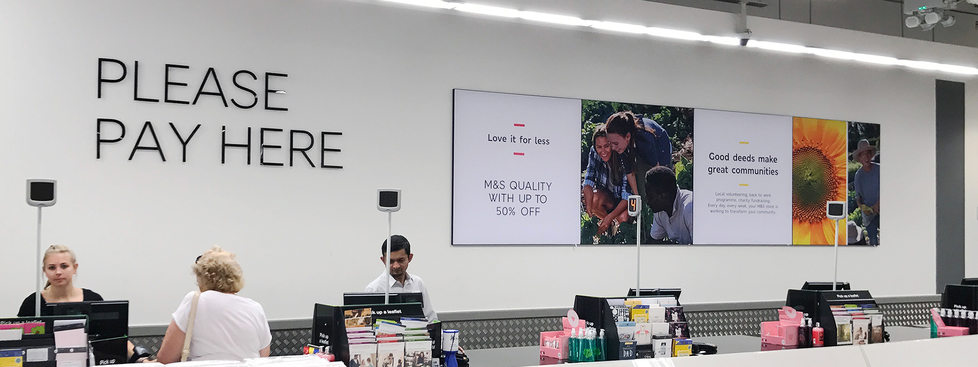
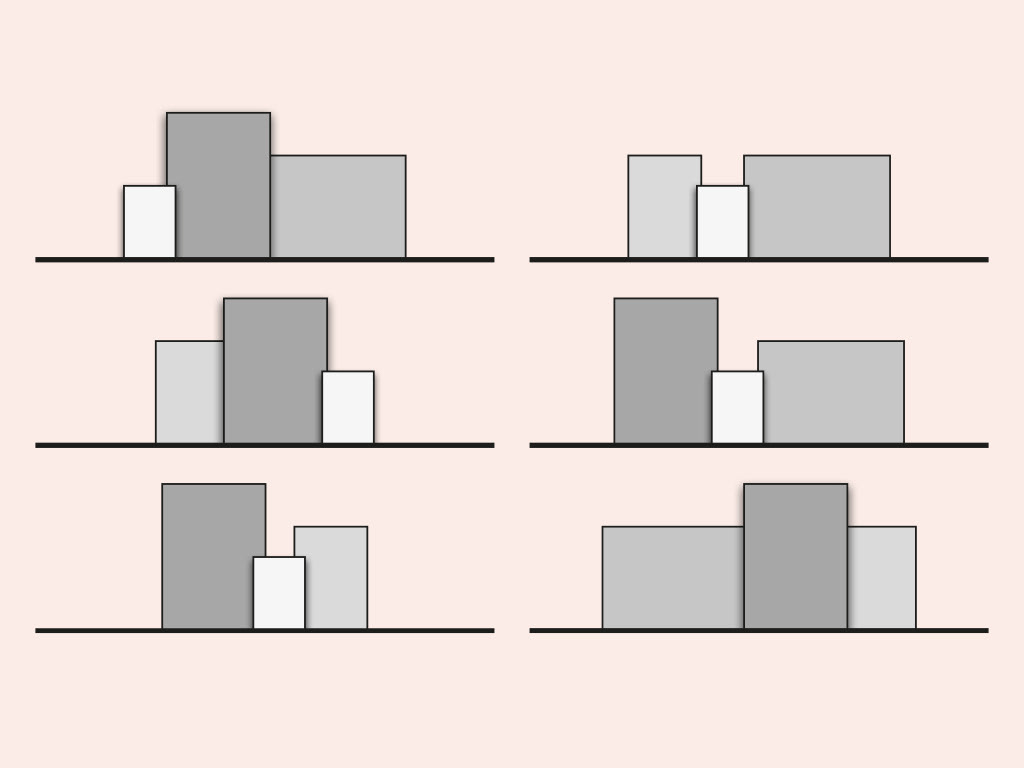
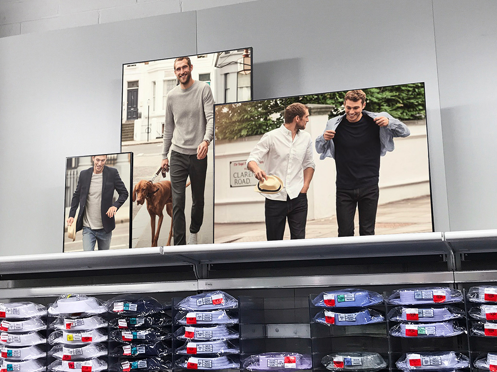
Compositional rules developed for perimeter frames
The branding and photography also had to accommodate seasonal crossover from master brand campaigns. Most of the signage is not static and changes quarterly, so the design had to take this into account and be efficient for future production.
M&S Outlet primarily advertises through social media, web ads and within the retail park websites that the stores are based in. I created templates for use within these channels.
Client: Marks & Spencer, 2017
Role: Art Direction, Design, Copywriting
Deliverables: Branding, Guidelines, Templates, POS, Digital


